A living identity
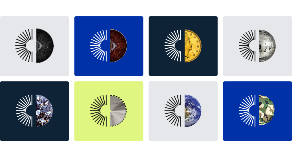
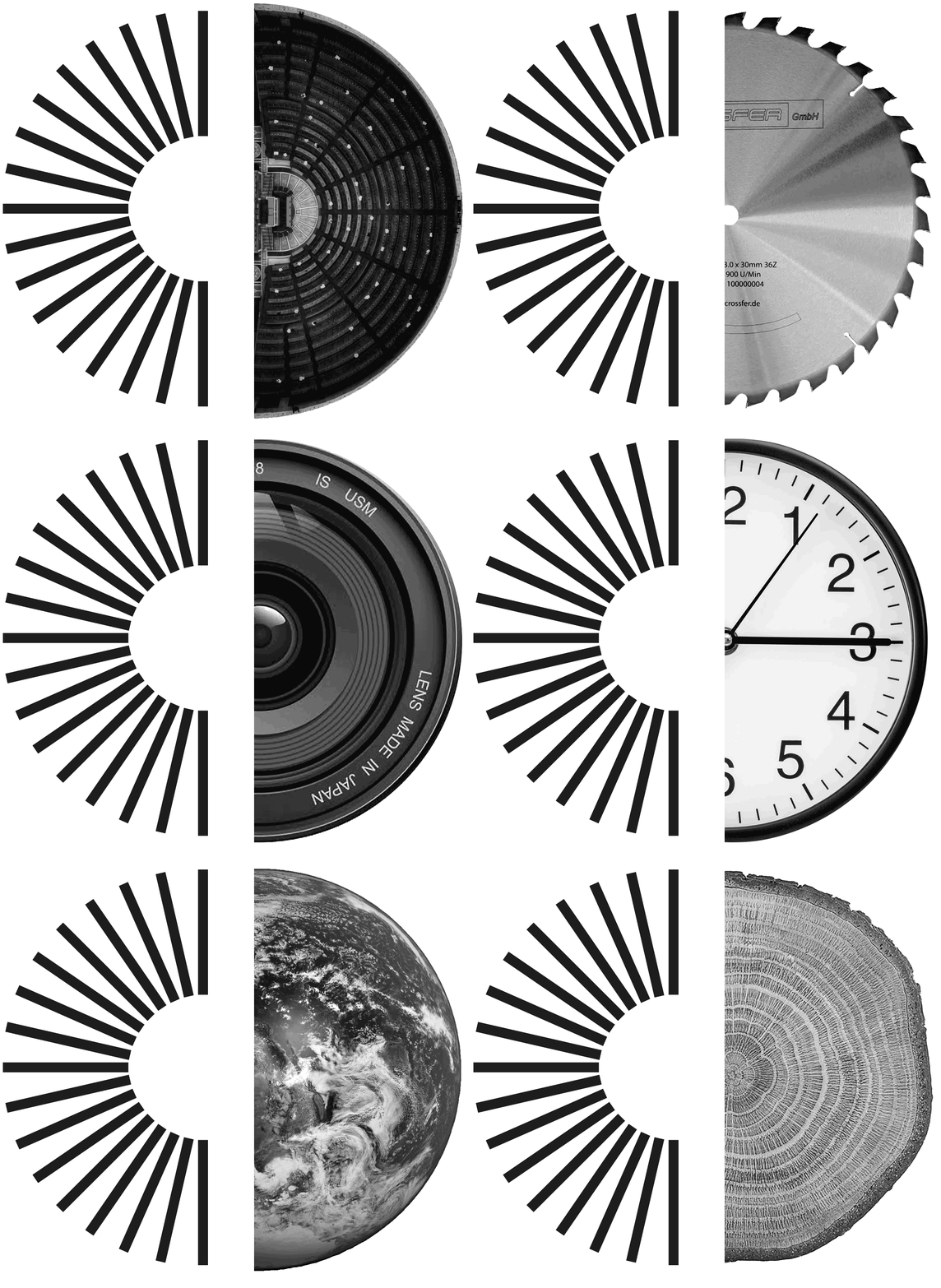
The Indigo Publications logo now features a semi-radial element when paired with the brand name, and a full radial design when used as a standalone icon. It can also be combined with a complementary half, illustrating the specific fields of expertise of our publications.
This identity in motion captures the energy driving Indigo Publications.
Concept genesis: returning to the source of Indigo
The design process was built on a return to the group’s origins, while projecting its core values into the future. The name "Indigo" itself stems from the indigo plant, a symbol of the Indian Ocean and a direct nod to the group’s very first publication: The Indian Ocean Newsletter.
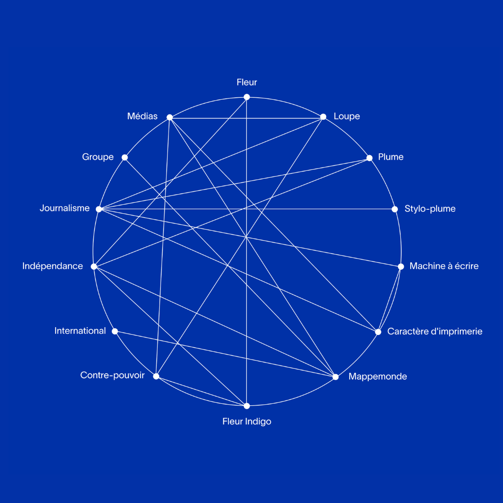
To craft this new identity, the Creative Team tapped into several powerful symbolic and linguistic themes:
- The group’s core foundations: investigative reporting, independence, and international perspective.
- Media iconography: featuring the quill, lead type, and the magnifying glass
- Le rayonnement de l’information, soulignant la portée mondiale de nos publications